New Year new color
13 Min.I think I can safely speak for most folks when I say we are ready to move forward with a new year. What better way to welcome 2021 in a positive way than with some color.
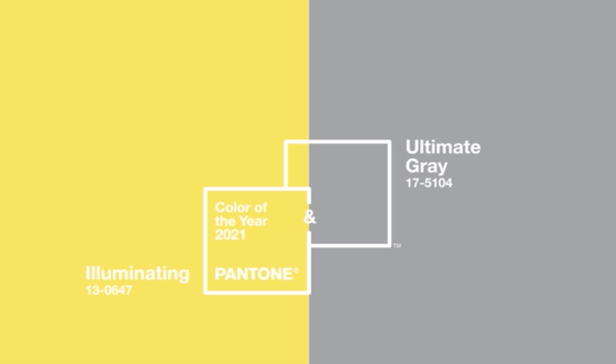
Pantone’s colors of the year speak directly to this idea and I love the reasoning behind their choices. “The union of enduring Ultimate Gray with the vibrant yellow Illuminating expresses a message of positivity supported by fortitude. Practical and rock solid but at the same time warming and optimistic, this is a color combination that gives us resilience and hope. We need to feel encouraged and uplifted; this is essential to the human spirit”
– Leatrice Eiseman, Executive director of the Pantone Color Institute.
our 2021 color picks
I asked our designers what colors they’re picking for the kitchens of 2021 and found that they are choosing colors for very similar reasons as Pantone. We learned in 2020 that the kitchen is truly the most important part of the home. It is the space that brings us together, nourishes us and provides a break from zoom backgrounds and screens. The kitchen should be a place of warmth and positivity.
Paula Accioly
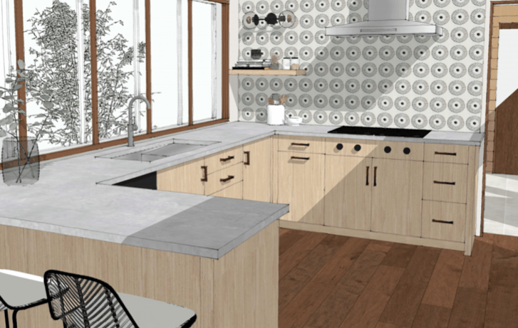
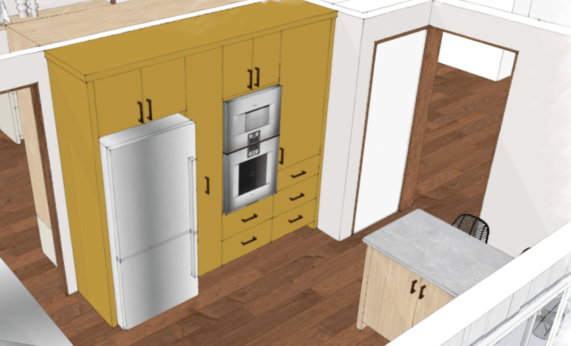
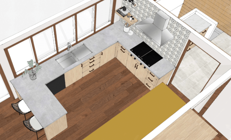
It looks as though Paula is already ahead of the color curve, no surprises there! Here’s a gorgeous space that will be installed soon that is right on trend with Pantone. Paula chose Farrow and Ball’s Babouche yellow and paired it with light gray countertops, rift white Oak with Rubio Monocoat White finish and a black, white and gray patterned tile. We’ll update with photos after this project has been completed, but here’s a peek at the plans.
Kathleen D’Apice
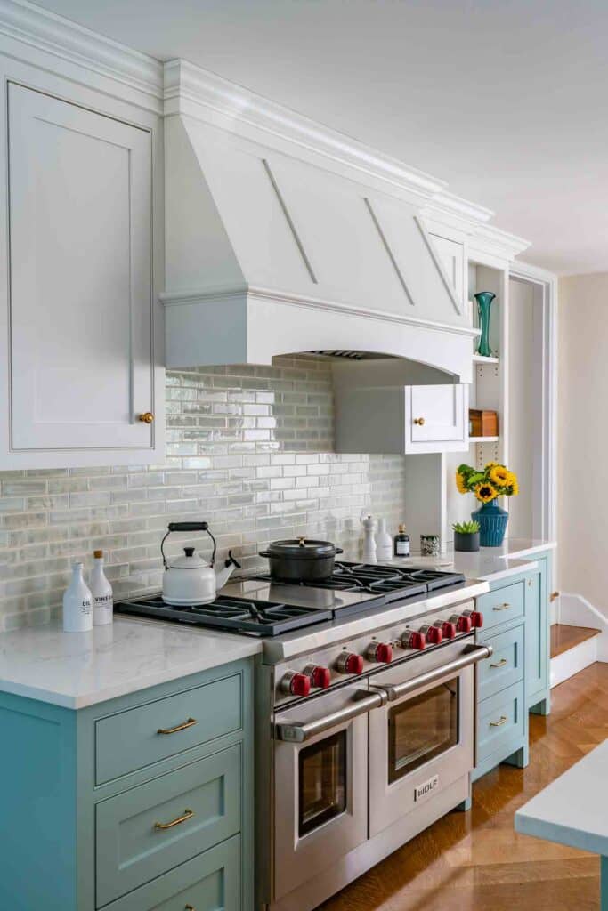
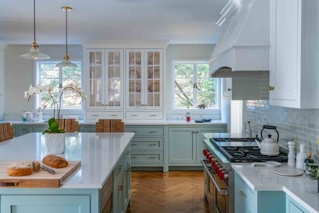
Kathleen brought some joyful color into a Chestnut Hill kitchen last year with the use of Farrow and Ball Green Blue No. 84. It’s bright and fun without being overbearing and it looks great with the rift white oak cabinet interiors (and the red knobs on the range!).
2020 wasn’t all bad
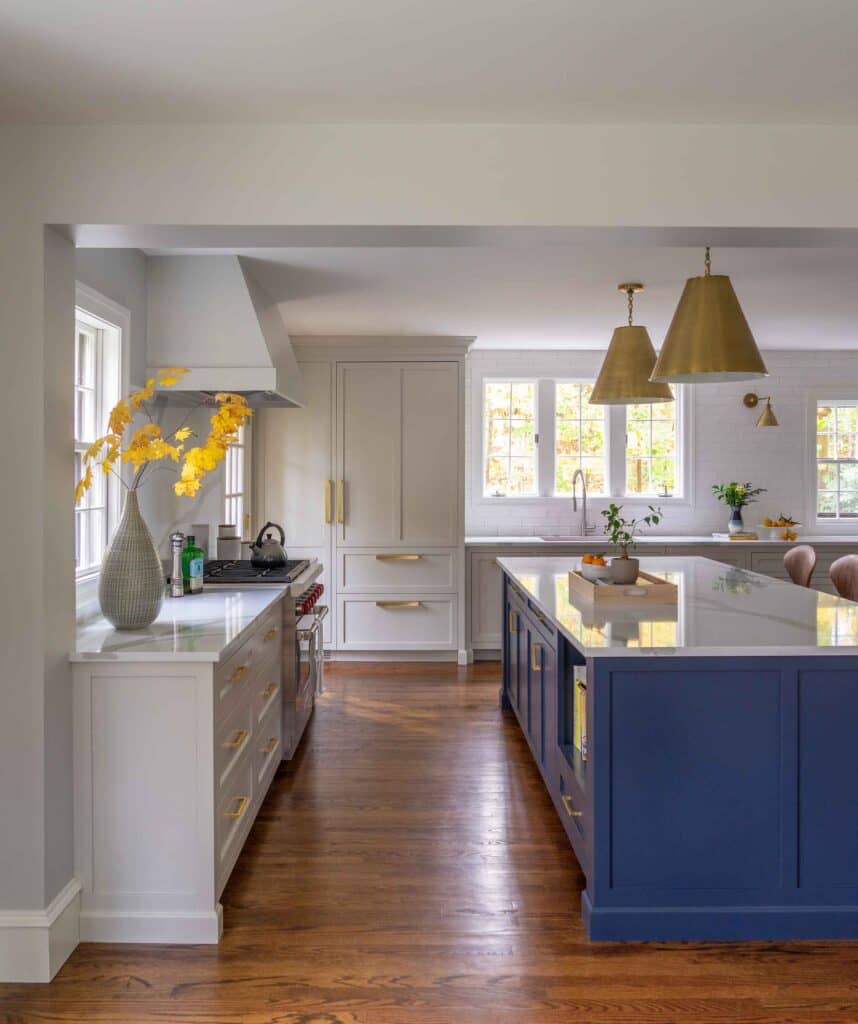
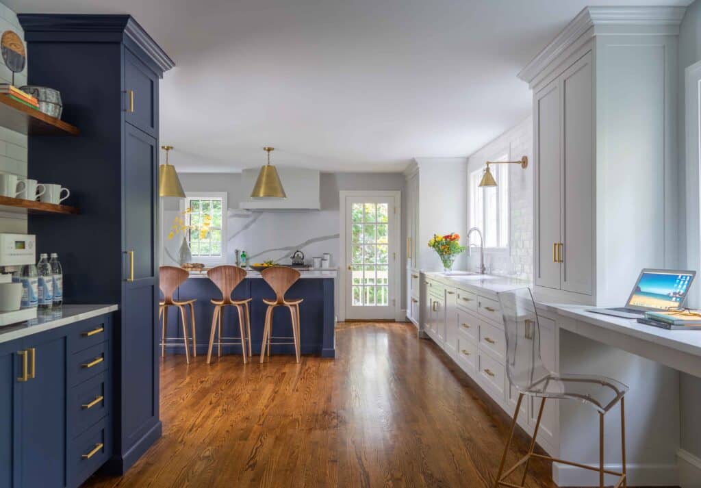
Pantone’s 2020 color of the year was Classic Blue, who knew we’d be feeling so blue for most of the year. Nevertheless, blue is a great color in the kitchen. And, once again we were ahead of the trend and this wonderful kitchen was designed, finished in Benjamin Moore Hale Navy and installed ready to show off last year.
Looking ahead
Our designers agree that strong, dark colors aren’t going anywhere. Paula says she will always love dark greens, like Farrow and Ball Studio Green, paired with neutral colors with natural wood, a combination that will stand the test of time.
Kathleen says black is back, especially with brass hardware or when used alongside white with wood accents to warm it all up. There are so many good black and white paint options but, Kathleen cautions, the most important thing is to make sure your chosen black works well under all lighting conditions throughout the day in the actual space, and to manage the proportions for a balanced outcome.
See our picks
Our showrooms are the perfect place to see cabinetry colors and ideas in person. Our new Boston Design Center showroom is changing every day as we finish up the wonderful new displays – with some fresh new color schemes. In the NY Metro area? Visit our Glen Rock showroom.
Don’t be afraid of color, our designers can help you pick the perfect hues for your space and create a kitchen that will be beautiful for years to come.
Visit us online or in person.

JF Content creator and marketing director. Olivia loves beautiful spaces, inside and outside. When she’s not writing and talking about gorgeous kitchens Olivia can be found riding her bicycle around the country.